
The appearance of 11th generation Tiger Lake processors is enhanced by Intel with the new minimalist logo. For the time being, his judgment is mixed. I mean, for the logo, too.
Intel is going through hard days (or rather months): the technological and market superiority that has made it the largest processor maker so far has evaporated nicely. AMD has found itself very popular with Ryzen in recent years, and then came the black soup when it was revealed that Intel was unable to move away from 10-nanometer manufacturing technology . That’s why now that the 11th generation Core processors have been officially announced, we needed a little extra.
The first generation of Tiger Lake chips has been unveiled by the manufacturer these days , and while remaining 10 nanometers, it seeks to restore customer (and, of course, investor) confidence with a new, more energy-efficient design and the incorporation of the Iris Xe, which partially replaces the integrated UHD graphics controller. And what better way to build trust than with a new image that reflects freshness and minimalist determination? Well, right.
Along with the announcement of the new processors, the company’s vice president and chief marketing officer, Karen Walker, announced a re-carving of the brand name, which will “better reflect the company’s role as a catalyst for world-changing technologies”. The announcement does not include facts about exactly how the post-Tiger Lake direction is planned, we can only find excellent wording on artificial intelligence and the rise of 5G, which Intel supports with a wide range of technologies.
In any case, let’s take a nice look at Intel’s two logos so far, and then the new one may come. So first come the classic, which the company has been using for roughly since its inception until 2006, and then the “worm” version, which was switched to when the Core microarchitecture was announced, and has continued to shine until today:
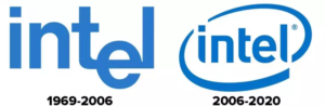
And now comes the new one, which supposedly minimalism indicates that the company is ready to provide solutions to the world’s most critical problems. According to the announcement, by retaining the past but with a thickened, more characteristic look, the fresh word image shows Intel’s stability and commitment. The dot at the top of the letter i has retained the iconic blue color, this will be the logo basically used, but different color variations will appear on different products.

After the emergence of the new logo on social media, there were quite mixed reactions. Some say the current version is too simple and doesn’t symbolize anything in the sky. There was also a self-appointed critic who thought the financial austerity was evident, as surely a zealous little schoolboy could have drawn the whole thing, or laid it out with some kind of sticky font. But let’s also leave the cynical voices, as a logo is ultimately just a logo, judging a company and a brand depends on how it picks up the glove against intensified competition and what it does to renew its own internal technology and organization .
So in that spirit, we’ll still leave a video on the brand transformation here, and then look forward to comments on the logo, Intel’s role and position in general, but there may even be posts where we come up with the best or worst tech logos. And I think a lot of people could tell us what it means to be renewed from the outside, and chaos is complete inside …